Designing Icons
I've been using Dribbble for about five years now. It's a great community and nice way to post project process. I was honored to be asked by Dribbble to do an interview for their blog series titled Design For. In the past, the series has had features focused on motion design, designing a can, and designing books in which they pick out a few dribbblers to tell more of their story.
Designing Icons featured words and work by Zach Roszczewski, Jory Raphael and myself. The article was put together by Susanna Baird, and posted over the course of a week. Here's the start of the series, click to read more:
“Today’s challenge: Design a family.
Family members aren’t carbon copies of one another. Each individual does their own thing, sports their own look. At the same time, though, they’re related. We should be able to look at them and know that. Got it? Create a set of individuals who are distinctly different AND visually connected.
Impossible? Maybe, but the task isn’t conceptually far off from what icon designers tackle every time they create a new icon set.”
For my feature, I focused on a set of icons I created for some sensory restaurant reviews.

I worked with an author and writer, Peter Hajinian, for an article he was working on that outlined some restaurant reviews in a NE Minneapolis neighborhood. Instead of rating a restaurant solely on its food, he took into account the decor, parking, music, lighting, service, atmosphere, etc. All of these things work together to affect the mood of a specific place.
He split up categories into the senses—sight, sound, touch, taste, smell. Within these categories, he would rate each restaurant with specific items. Such as—Sight: bright, artsy, colorful, dark, etc. Smell: grill, fryer, baking, coffee, curry, etc.
To be displayed on a map, each restaurant would have its collection of visual icons that describe the senses next to its location. Since these were to be all displayed together on a map of about 20 restaurants, we had to keep into account the size of the icons, and how the various characteristics would be grouped together.
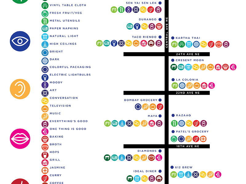
A good way to start the visual was to color coordinate each main sensory category. Blue=sight, green=touch, yellow=sound, pink=taste, red=smell. This was one good way to create an easy-to-use color system key on the map.
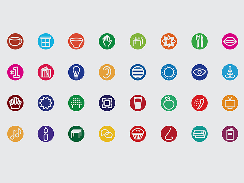
After touring all the restaurants, he came up with a good number of in-common characteristics. Each one of these then needed a specific visual icon. I wanted to keep all the icons similar, visually, as a part of a set, especially because any number of them would be grouped together in combination with others.
A challenge with these were that it was sometimes tough to convey visually exactly what the writer chose to represent. For example, an icon with a #1 mean that a restaurant was really known for one great item on their menu—versus the menu icon, which meant that everything was good on their menu. A chandelier icon meant that there were high ceilings, and a picture frame meant there was art hanging in the space.
We realized that having a descriptive key on the map was probably a good idea as you’re getting a first glance at the overall picture and want to know a bit more of what you’re looking at. The map was also accompanied by an excerpt about each restaurant and the writer’s experience.
A challenge in this was making the icons meaningful. There were to be a lot on one page and they needed to make the experience easier to understand, not make it more confusing. The visual needed to be clear and easy to understand, and the key needed to be easy to go back and reference.
The first step I took in creating designs for all the icons was making a few small sketches for each, to figure out an idea and overall plan. It’s always an important step to plan it all out before designing, to make sure things will read great as a set.

From there I start working in black and white with basic shapes to establish a consistent look, that way I’m not just relying on color. It’s all about form and legibility. Consistent line weight throughout, outlines versus solid shapes, same amount of detail for each, and staying within a square box boundary to be relatively the same size.

I then pair a couple of icons together to get a sense of what a collection will look like —making sure they can stand on their own, in a small group or as a set. Also looking at distance away from each other — do they need a lot of breathing room between each icon, or do they look ok tightly packed together, keeping in mind also that space might be limited or squeezed in on the map.

After seeing these icons together and realizing how much color would have a play, I decided to bring a consistent shape for a background color by putting each icon into a circle shape. This is a way to allow the category color to stand out and be easily recognizable with a quick glance.

The color categories would work nicely, but some of the restaurants had more than one characteristic from each category. For example, a brewery had high ceilings, art on the walls, and natural light—all a part of the blue “sight” category. I wanted each one to really stand out on its own, so a user is able to look at the map as a whole and quickly find all the places that have, say, art on the walls. Within each category I broke down different tones and slight color adjustments to assign each characteristic with not only its own icon, but color as well—even though in the same tonal region.
In the end all the locations were mocked up on a map of Central Avenue NE. Each had their string of icons that always appeared in the same order from touch, sight, sound, taste to smell. Walking up and down Central with this handy map would make it easy to find any sort of specific experience you’re looking for.

Check out more of my process work: Dribbble Aulku
And check out some more icon work: Iconography