North Memorial
A while back I was asked to work on some strategy, concepts and logo designs for a local healthcare company that was in the process of rebranding. I'm now seeing their new brand pop up around town and it reminded me to to a write a case study on the work. While the final mark was not one that I designed, it's still fun to see where it ended up.
About a year ago, North Memorial Health Care was looking at some potential new naming conventions to go along with their new image and positioning. With the names still up in the air, I was able to take a few of the options and add some strategy and designs.
Those new names were:
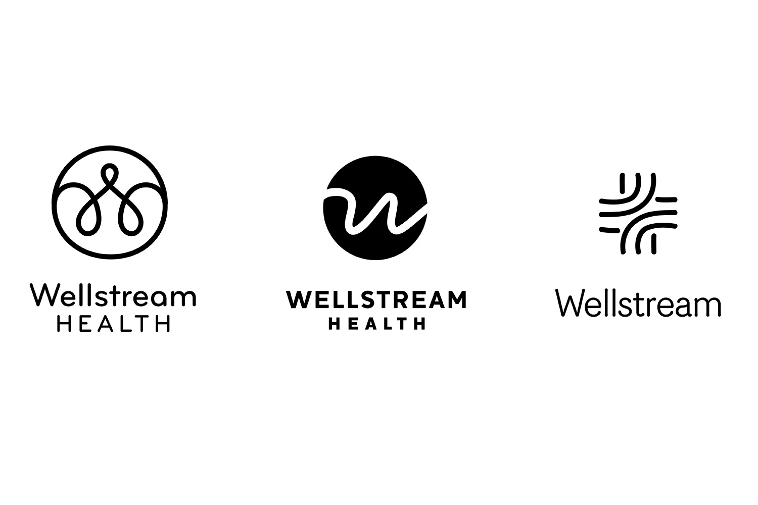
- Wellstream Health
- CircleNorth Health
- One North Health
- North Memorial Health
I was able to explore these new names on my own terms and bring some exploration and definition to them.
I tend to focus on a simple, abstract icon or mark that conveys the name and concept behind it. From there I find ways for that to stand as an ownable mark, ways for it to fit with some chosen typography, or even ways for the mark to influence the type.
Wellstream Health had some of the following characteristics to it's name, to potentially influence the mark or type:
- water, natural, elements, essential
- streamline, efficient, smooth, flow
- path, lead, guide, route
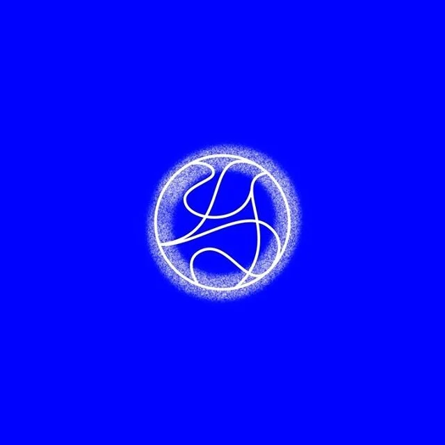
Circle North had some of the following characteristics to it's name, to potentially influence the mark or type:
- lead, guide, direct, compass
- full circle, ongoing, complete
- encompass, surround, enclose, contain, care
OneNorth had some of the following characteristics to it's name, to potentially influence the mark or type:
- the only one, trusting, individual, empowering, legacy
There was also just sticking with North Memorial HealthCare name and updating the logo
After narrowing down some options, a few of them were selected to refine and add in color palettes.
While it's still a great, yet quick, process and it's a pleasure to be able to work with new clients, brands and people, it's not always the case that the work I create gets used for the final outcomes. But it's nice to be able to be a part of something great and meaningful for a brand.
Here's where they were before. And where they ended up. I don't know who was in charge of this final logo so am not able to give proper credit. Please comment if you know!
Before
After


